CanFURence — Website Re-Design
Background
CanFURence is a furry convention located in Ottawa, ON, Canada. I joined their volunteer team as a front-end web designer, as one of the convention co-chairs was looking for someone with experience designing websites. I was tasked with re-designing the website's appearance in accordance with the theme for the 2019 convention ("Furry Mystery"), as well as cleaning up the navigation and site map.
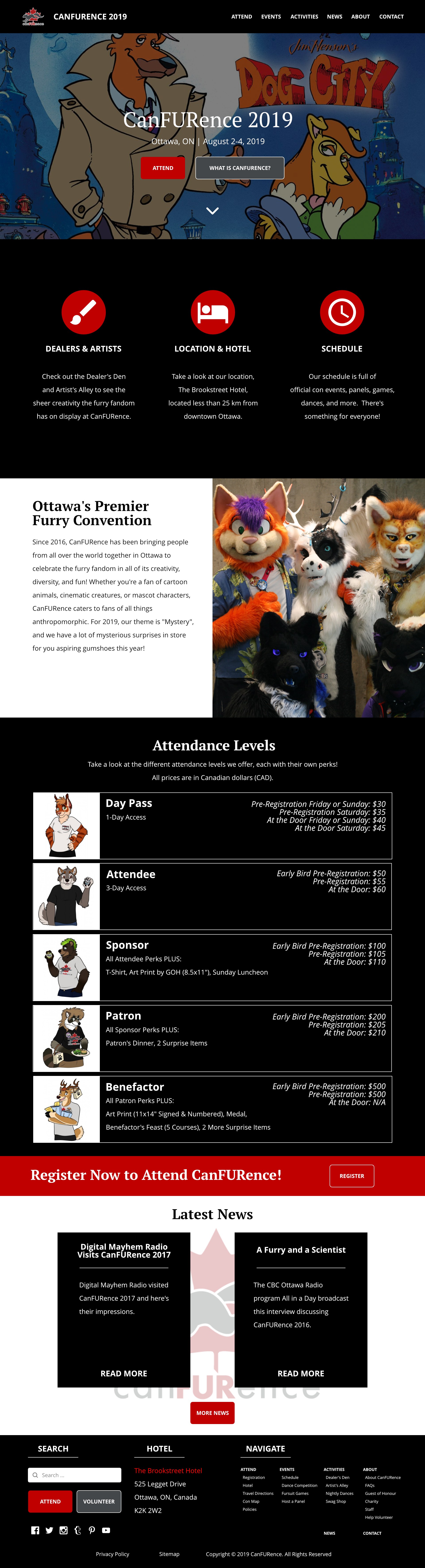
For reference, here is what the website initially looked like, and here is the website for CanFURence with input from the design ideas I submitted.
Design Requirements
The theme of the site (colour, typography, and layout) had to fit the "Furry Mystery" theme of the convention.
The con artwork of the Guest of Honour, the artist Betsy the Beaver, was required to be front and centre on the home page of the site as the first thing a visitor sees.
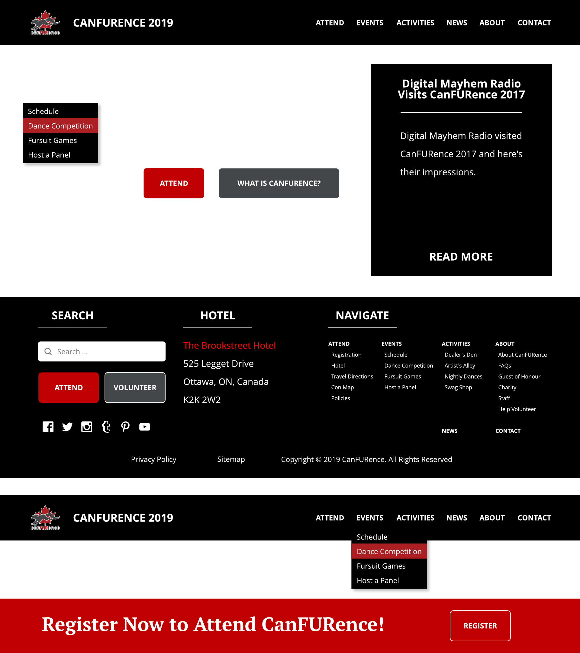
It needed to be easily programmable in Joomla, the content management system the convention's web programmers were hosting the website on. This meant the design had to follow common paradigms of web UI design.
There needed to be a way for visitors to access CanFURence's social media.
The design could not affect the functionality of the site. Visitors needed to be able to register for the convention, book a room at the convention hotel, view the events schedule, and otherwise be able to see and use all areas of the site.
Ideation
I decided to go with a dark theme for the website, because it fit with the theme of "mystery." I strictly limited my colour choices to a monochromatic colour scheme of black, white and grey, with red being the colour for highlights because the logo for CanFURence was also red and it made for a striking contrast.
Since the Guest of Honour's artwork needed to be on the front of the website, I designed an above-the-fold call to action with the artwork in the background. The text and buttons would be centred over the artwork, which would have space in the middle to enhance contrast. As a temporary background , I used an image from the animated TV series "Dog City" because it fit the detective and mystery theme.
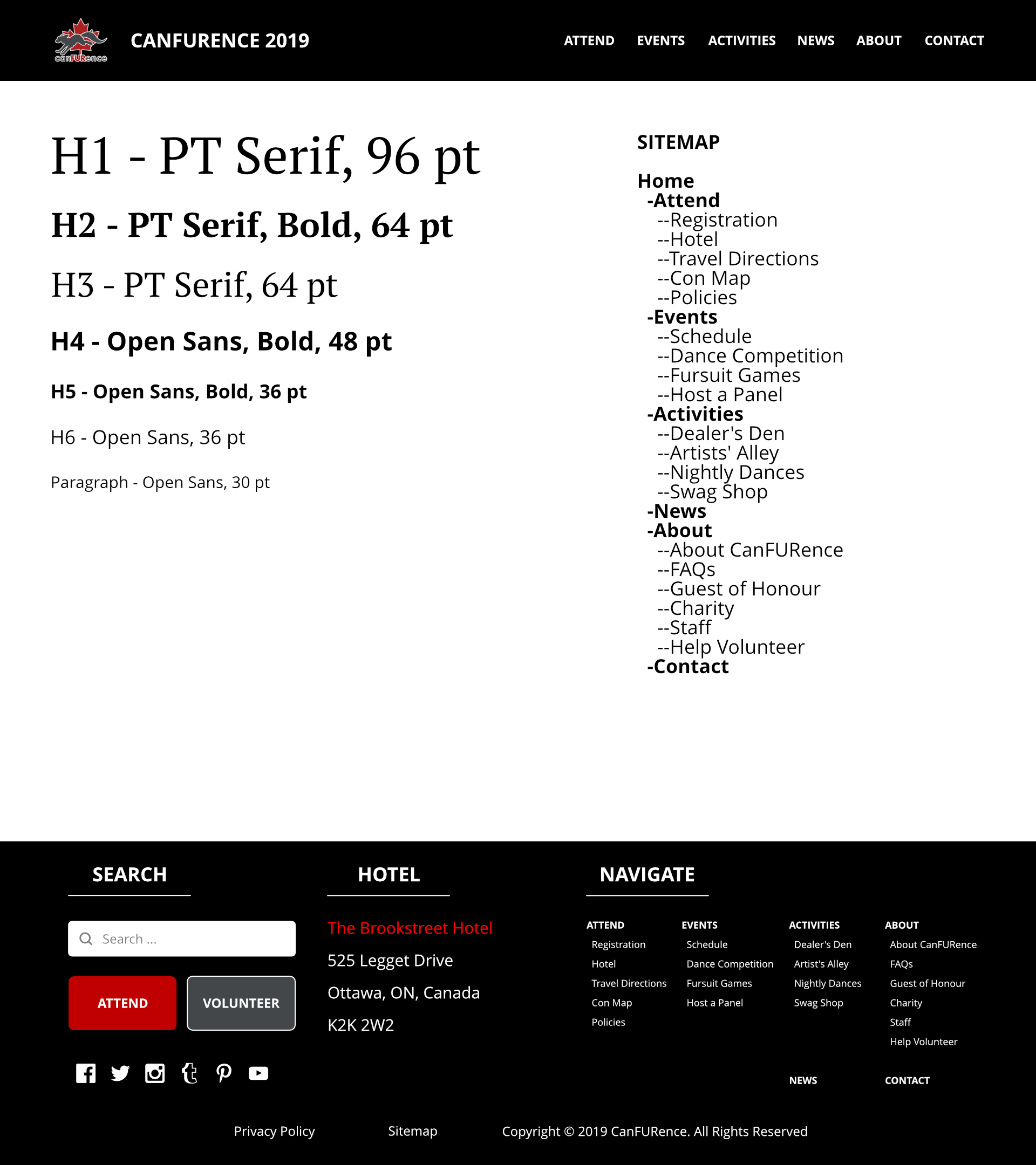
To make it easier to program, I made sure that each content page was simply a white space for text and other functionality to be added. This ensured that links and buttons to registration, hotel booking, etc. would still work. I stuck to two typefaces, PT Serif for major headers and Open Sans for smaller headers and paragraphs.
I provided assets for the main menu header, buttons, the footer, blocks of text for blog articles, calls to action, and other parts of the site. Social media and expanded navigation would be in the footer. I also included a site map to help structure the information architecture of the website. The home page would be laid out with full-width blocks to distinguish content and calls to action.
Final Design
Although it was not possible to program everything from my design into the final version of the website, the overall theme was implemented and was a major improvement from the 2018 website. You can see the finished website for CanFURence here!